|
|
Post by silvus on Oct 4, 2009 5:57:29 GMT -6
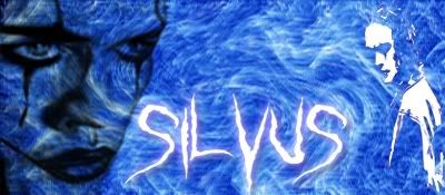
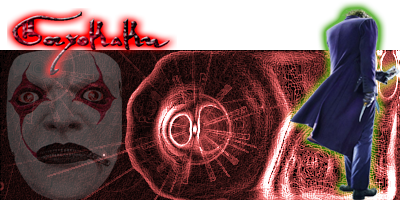
and put together two new sigs using effects i found for making new backgrounds give me some positive feedback pls ^^ The 1st one is a Silvus Sig  The second is a gory sig which may become his new look.  |
|
|
|
Post by Hollywood on Oct 4, 2009 9:08:25 GMT -6
I like the current Silvus sig better  But I really love the new Gory sig you just made ;D |
|
|
|
Post by Jillie on Oct 4, 2009 10:01:58 GMT -6
I LOVE the Silvus sig. It's so artsy!
|
|
MGM
Brooklyn Brawler
 
Posts: 168
|
Post by MGM on Oct 6, 2009 22:28:16 GMT -6
very nice my good sir, I love 'em both and really digging the Gory one *thumbs up*
|
|
|
|
Post by freak on Oct 7, 2009 13:49:22 GMT -6
I don't understand why you don't just make Gory look like the Dark Knight Joker...to me it just looks like Sil's look and Gory's look too similar. (The reason why I say that is because the second pic sort of looks like you're going in that direction...but then again, it's your character, your call, right?)
|
|
|
|
Post by silvus on Oct 7, 2009 16:22:38 GMT -6
He is going in that direction, but the mask will be something that stays with him, more or less, but he wont necessarily always where it.
Also there is a reason why the face paint and the mask look familiar, but thats to do with character history that may one day get brought up.
|
|